7 Common Mistakes in Design Feedback - Avoid These Errors!
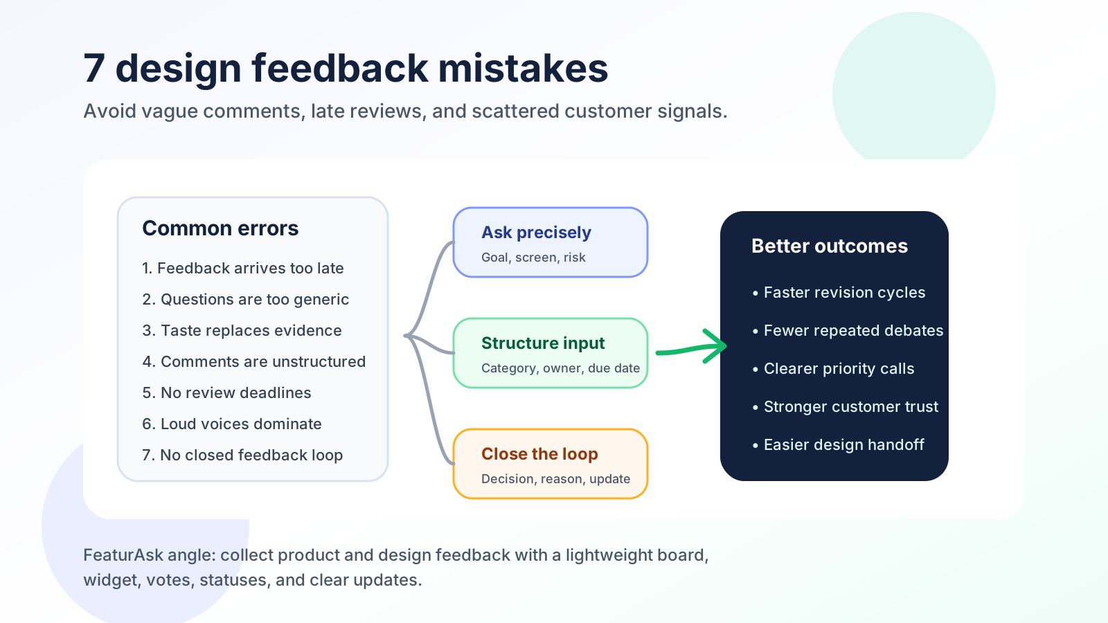
Design feedback can turn a good draft into a better product experience, but only when the process is clear. The keyword sounds simple: 7 common mistakes in design feedback avoid these errors. In practice, those mistakes show up as vague comments, late opinions, unresolved debates, and customer signals scattered across calls, chats, tickets, and screenshots.
For a small SaaS team, agency, ecommerce store, or founder-led product, design feedback has to do two jobs at once. It should improve the interface in front of you, and it should teach the team what customers need next. This guide expands the common six-mistake framing into seven mistakes, because one missing step often causes the biggest damage: failing to close the loop after feedback has been reviewed.
Use this as a checklist before your next landing page review, app redesign, checkout update, onboarding refresh, or prototype critique.
Seven design feedback traps that slow better product decisions
The best design feedback is specific, timely, respectful, and tied to a goal. It helps the team decide what to change, what to ignore, and what to test. The worst design feedback creates motion without progress: everyone talks, the designer revises, stakeholders return with new preferences, and no one knows whether the design actually became easier to use.
Nielsen Norman Group describes design critiques as structured sessions focused on improving a design rather than judging the designer. That distinction matters. Feedback should be about outcomes, evidence, constraints, and user needs, not personal taste or politics.
Before asking for comments, define the review goal. Are you trying to validate visual hierarchy, reduce checkout friction, confirm brand fit, improve accessibility, test a new feature concept, or decide which variant deserves development time? A focused goal makes every comment easier to evaluate.
1. Waiting until the design is too expensive to change
The first mistake is waiting too long to ask for feedback. Teams often protect early drafts because they do not want half-formed work judged. That instinct is understandable, but it can create expensive rework. If the first serious feedback arrives after the design is polished, the team may discover that the concept, message, flow, or call to action is wrong.
Invite feedback in stages. Early feedback should cover direction: user problem, page purpose, information hierarchy, and whether the proposed flow matches the product goal. Mid-stage feedback should cover interaction details, content, trust signals, and edge cases. Late-stage feedback should focus on polish, accessibility, responsiveness, and launch readiness.
Internal feedback is useful first because your team knows constraints, customers, support history, and business goals. External feedback becomes valuable when you need to understand whether real users interpret the design as intended. For teams collecting product requests alongside design input, a simple intake pattern like feature request templates helps reviewers describe the problem instead of simply suggesting UI changes.
A practical rule: ask for feedback before the work feels final. If a comment would be painful to hear, that is often a sign you should hear it earlier.
2. Asking broad questions that invite vague opinions
Questions like “Do you like it?” or “Thoughts?” feel easy, but they usually generate weak feedback. Reviewers respond with opinions, adjectives, or personal preferences: “Looks clean,” “I like blue,” “Feels busy,” or “Can we make it pop?” Those reactions may contain clues, but they do not tell the team what to change or why.
Ask questions that point reviewers toward the decision you need to make. For a homepage hero, ask: “Can a first-time visitor tell what the product does in five seconds?” For a pricing page, ask: “Which plan feels most relevant to a small team, and what information is missing before purchase?” For a checkout redesign, ask: “Where might a shopper hesitate or worry?”
Segment the questions by role. Customers can explain confusion, expectations, and language. Support can highlight repeated complaints. Sales can describe objections. Designers can assess hierarchy and consistency. Engineers can flag complexity. Founders can evaluate positioning and business fit.
Good questions also reveal trade-offs. If the design must increase signups without hurting trust, ask reviewers to evaluate both clarity and credibility. If the design must reduce friction while collecting required data, ask whether every field earns its place.
3. Treating taste, usability, and business goals as the same thing
Design feedback becomes noisy when taste is treated as evidence. A stakeholder may dislike a color, a founder may prefer a different layout, or a teammate may ask for a trend they saw elsewhere. None of those comments are automatically wrong, but they need to be translated into objective concerns.
Instead of debating taste, ask what problem the opinion points to. “I do not like this color” might mean contrast is weak, the tone feels off-brand, the button does not look clickable, or the reviewer simply prefers another palette. “The page feels crowded” might mean spacing is tight, hierarchy is unclear, or the reviewer is reacting to too many competing calls to action.
Use objective principles as filters. Usability heuristics, accessibility guidelines, brand standards, conversion goals, and user research should outweigh isolated preference. Nielsen Norman Group’s 10 usability heuristics give teams shared language for visibility of system status, consistency, error prevention, and recognition over recall. The W3C WCAG 2.2 recommendation is also a current reference for contrast, keyboard access, target size, and focus appearance.
When feedback is subjective, do not reject it immediately. Reframe it. Ask, “What user outcome are we trying to protect?” That turns preference into a testable discussion.
FeaturAsk helps small teams move design feedback out of scattered messages and into a lightweight board where comments, votes, and statuses can be reviewed together. It is $29.95/year after a 30-day free trial, with no credit card required.
4. Letting scattered comments become the feedback system
Unstructured feedback creates confusion because every comment appears equally urgent. A designer receives notes in Slack, email, a Figma thread, a support ticket, a meeting transcript, and a client call. Some comments refer to old versions. Others conflict. A few are important but buried in conversation.
Create a structure before feedback starts. Define categories such as visual hierarchy, copy clarity, usability, accessibility, brand fit, technical feasibility, and business impact. For each comment, ask reviewers to include the screen, the issue, the reason it matters, and the suggested next step if they have one.
For agencies, structure is especially important because clients may bring many stakeholders into the review. Without categories, one stakeholder comments on brand mood, another edits microcopy, another questions strategy, and another asks for a feature outside scope. Clear categories help everyone contribute without turning a design review into a project reset.
For product teams, structure also makes prioritization easier. A comment about a button label is not the same as a comment that users cannot find the primary action. A visual preference is not the same as an accessibility blocker. A customer request from a high-value segment may deserve more attention than a one-off internal preference.
A simple feedback board can help because it separates ideas, comments, duplicates, and decisions. If you want to compare lightweight tooling options for this workflow, see user feedback tools you need to try.
5. Leaving feedback windows open forever
Feedback without a deadline expands to fill the project. People comment late, designers revise late, and the team reopens decisions that should already be settled. This is frustrating for product teams and even harder for agencies that need to protect scope and timelines.
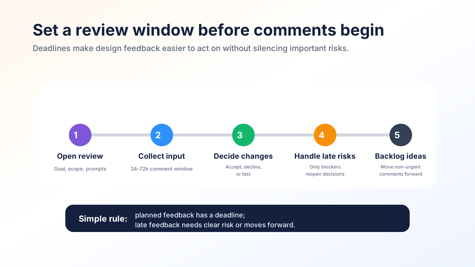
Set a review window at the beginning. For small changes, 24 to 48 hours may be enough. For a major redesign, use staged deadlines: concept review, content review, usability review, final polish, and launch approval. Each stage should have a clear owner and a decision rule.
Deadlines should not silence useful feedback. They should separate planned review from late exceptions. If a late comment identifies a serious usability or legal problem, handle it. If it introduces a new preference after approval, move it to a future iteration unless it is clearly worth delaying the project.
A helpful message sounds like this: “Please add feedback by Thursday at 3 p.m. We will review comments Thursday afternoon, decide what changes go into this release, and move lower-priority ideas to the backlog.” That one sentence tells reviewers when to act, what happens next, and how their input will be used.
6. Letting the loudest reviewer define the design direction
Design reviews can be dominated by the loudest person, the highest-ranking person, or the person most comfortable critiquing visual work. Quiet teammates, junior designers, support reps, developers, and customers may notice important issues but hold back.
Build participation into the process. Start with async written feedback so everyone can think before reacting. Ask people to comment on specific prompts rather than freestyle. In live reviews, invite each role to speak to their area of knowledge: support for common complaints, engineering for complexity, marketing for message clarity, customer success for onboarding friction, and design for visual and interaction principles.
Anonymous input can be useful when power dynamics are strong, but anonymity is not always enough. You still need a way to evaluate comments. Ask reviewers to connect feedback to a user problem, goal, or risk. That keeps the discussion constructive and prevents anonymous feedback from becoming a place for unsupported criticism.
Customer feedback deserves room too. Internal reviewers can miss assumptions because they already understand the product. Customers and prospects reveal whether the design explains itself. Ecommerce stores can ask shoppers where they hesitated. SaaS teams can ask trial users what blocked activation. Agencies can ask client customers whether a new page answers their buying questions.
7. Collecting feedback without explaining the decision
This seventh mistake is the one many teams overlook. They collect comments, make decisions, and then never tell people what happened. Reviewers stop contributing because feedback feels like a black hole. Customers stop voting because they never see progress. Internal teams keep asking the same questions because decisions are not recorded.
Close the loop in three ways. First, mark the decision: accepted, declined, needs research, planned for later, or already addressed. Second, add the reason. A declined comment with a clear reason builds more trust than silence. Third, notify the right people when the design changes, ships, or moves to a later backlog.
For product design, closing the loop improves future feedback quality. Reviewers learn what kind of input is useful. Designers avoid repeated debates. Product managers can connect design improvements to customer demand, support volume, conversion goals, or roadmap themes.
This is where a lightweight public or private feedback board becomes more than a collection box. It becomes a decision record. The workflow behind feature voting for small teams is useful here because votes and comments can surface patterns, but statuses and explanations show what the team actually decided.
How to collect design feedback without creating more noise
Design feedback tools should match the team’s size, workflow, and review style. A large enterprise may need permissions, audit trails, research repositories, prototype testing, and complex integrations. A small team usually needs something simpler: capture the comment, connect it to the right draft or request, review duplicates, decide priority, and update the people who care.
Common categories include design collaboration tools, feedback boards, survey tools, session recording, usability testing platforms, issue trackers, and customer support systems. Each category is useful for a different question. A design collaboration tool helps teams comment on screens. A survey helps collect structured reactions. A usability test shows where people struggle. A feedback board helps organize requests, votes, priorities, and status updates over time.
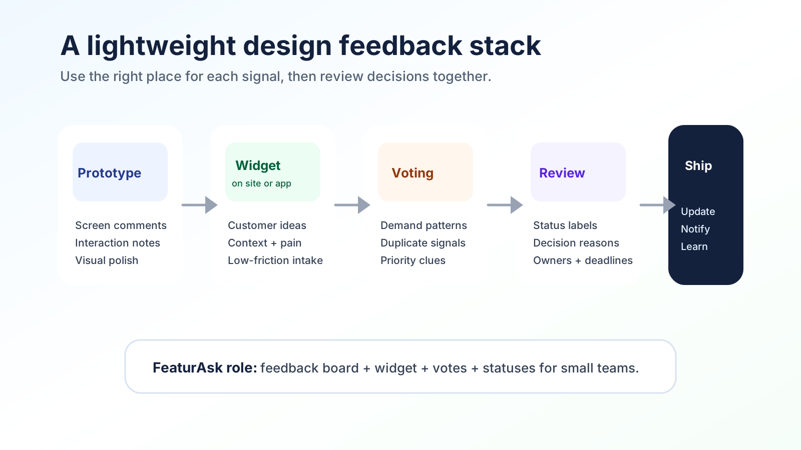
FeaturAsk fits the lightweight board and widget part of the workflow. A founder, agency, ecommerce operator, or small SaaS team can add a feedback widget, collect design and product suggestions, let users vote or comment, and review everything in one dashboard. That is helpful when design decisions are connected to broader product requests, not just a one-time mockup review.
When evaluating tools, look for five qualities:
- Low friction for reviewers. If feedback is hard to submit, you will hear only from the most motivated people.
- Clear organization. Comments should be grouped by topic, screen, feature, or status.
- Duplicate handling. Repeated requests should strengthen the signal instead of creating clutter.
- Decision visibility. Reviewers should know whether feedback is under review, planned, declined, or shipped.
- Affordable ownership. Small teams should not need an enterprise budget to run a serious feedback loop.
A practical stack might be: a design tool for screen annotations, FeaturAsk for customer-facing feedback and voting, a project board for delivery tasks, and short usability sessions for high-risk flows. Avoid scattering decisions across tools that no one reviews together.
FeaturAsk gives small teams and agencies a simple way to collect design and product feedback with a board and widget instead of a heavy product suite. Start with a 30-day free trial, no credit card required, then continue for $29.95/year.
Final design feedback checklist
Design feedback works when it is treated as a decision system, not a comment dump. The seven mistakes to avoid are waiting too long, asking generic questions, mixing taste with objective principles, accepting unstructured feedback, skipping deadlines, letting one voice dominate, and failing to close the loop.
You do not need a complicated process to fix these issues. Start each review with a goal, ask specific questions, organize comments by category, set a deadline, invite quieter voices, evaluate feedback against user needs, and record decisions. Then tell reviewers what changed. That final step turns feedback from a one-time critique into a repeatable trust-building loop.
For small teams, the best design feedback system is the one people will actually use. Keep it lightweight, visible, and connected to real product decisions. Use screen comments for draft details, customer input for market reality, and a feedback board for priorities and follow-up.
Ready to collect clearer product and design feedback without adding heavy process? FeaturAsk helps you launch a feedback board and widget, review customer ideas, prioritize requests, and close the loop. Try it free for 30 days with no credit card required.