6 Tips to Enhance Your User Onboarding Experience
Last updated April 23, 2026
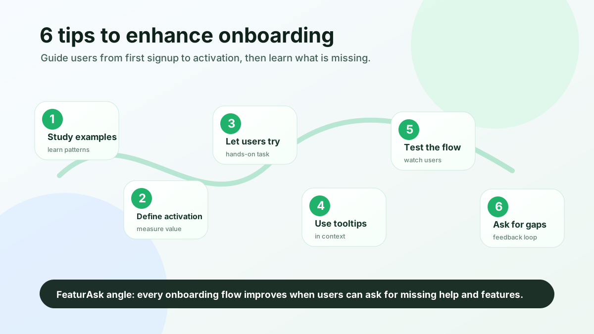
Quick answer: to enhance onboarding, focus on the shortest path from signup to value. Find confusion, define activation, give users something meaningful to try, use tooltips only in context, test with real users, and keep a visible feedback channel open for missing help, features, and expectations.
Many teams treat onboarding as a one-time product tour. A new user signs up, sees five modals, clicks “next,” and then faces a blank dashboard. That is a presentation, not onboarding.
Great onboarding is guided momentum. It helps the user understand what matters, take the first useful action, and feel confident enough to continue without support. Below are 6 tips to enhance your user onboarding experience while keeping the process practical and measurable.
Find the activation gap before adding more onboarding steps
User onboarding is difficult because new users arrive with partial context. They may understand the problem they want to solve, but they do not yet understand your product language, settings, assumptions, or sequence to success.
Your team has the opposite problem. After months of building the product, every menu item feels obvious. Good onboarding requires you to temporarily forget internal knowledge and design for someone seeing the product for the first time.
There is also a timing challenge. Users rarely want a long lesson before they can try the product. Nielsen Norman Group’s guidance on <a href="https://www.nngroup.com/articles/onboarding-tutorials/" rel="nofollow">onboarding tutorials</a> emphasizes that onboarding should support users in context, not force them through unnecessary instruction before they can act. That principle matters even more for small-team products, where buyers often sign up between other tasks and expect quick proof.
The common onboarding problems are easy to recognize:
- The product asks for too much information before showing value.
- The first screen is empty and gives no example of success.
- Tooltips explain obvious buttons while ignoring confusing decisions.
- Users cannot ask for missing documentation or features from inside the product.
- The team measures signups but not activation or onboarding drop-off.
A stronger onboarding experience starts by reducing cognitive load: tell users what to do first, why it matters, and how they will know they have made progress.
1. Borrow patterns, then adapt them to your first-value moment
The fastest way to improve onboarding is to study how other products help users reach value. Look at products inside your category, but also study products with similar setup patterns: team invitations, data imports, browser widgets, integrations, or public publishing.
Do not copy surface details. A beautiful progress bar does not fix a confusing activation path. Instead, ask practical questions as you review examples:
- What is the first meaningful action the user is asked to take?
- Does the product explain why the action matters?
- Is the user shown a blank state, sample data, or a template?
- Which steps are required now and which are deferred?
- Where can the user ask for help without leaving the flow?
- Does the onboarding end with a real outcome or just a completed tour?
You can also learn from poor onboarding. When you abandon a product, write down why. Was the value unclear? Did setup feel risky? Did the tool ask you to invite teammates before you trusted it? These notes capture emotional friction.
For a small team, a simple swipe file is enough. Create a shared document with screenshots, short notes, and the specific pattern you might adapt. If you are planning onboarding around a new product or major release, connect it to your broader product launch communication plan. Launch messaging sets expectations before signup; onboarding must fulfill those expectations immediately after signup.
2. Make activation the measure of onboarding success
Activation is the point where a user experiences the product’s promised value. It is not the same as account creation, email verification, or profile completion.
To improve onboarding, define one primary activation event. For a project management tool, activation might be creating a project and assigning the first task. For a feedback platform, it might be creating a board, adding the widget, collecting the first request, or marking a request as planned.
Once activation is defined, design onboarding backward from that event. Remove or delay anything that does not help the user reach it. This is where many onboarding flows become easier. Instead of asking, “What features should we introduce?” ask, “What does the user need to do in the next five minutes to experience value?”
Product benchmark research from Pendo shows why this matters: teams increasingly evaluate products by actual usage, retention, and engagement signals, not just acquisition volume. Their current <a href="https://www.pendo.io/product-benchmarks/" rel="nofollow">product benchmarks</a> are a useful reminder that activation and ongoing engagement need to be measured as product outcomes.
Useful onboarding metrics include signup-to-activation rate, time to activation, step completion, skipped optional setup, help requests, feature requests from non-activated users, and trial-to-paid conversion by activation cohort.
The qualitative layer is just as important. Analytics can show that users drop off during widget installation, but feedback explains why. Maybe the install instructions assume a developer, the copy does not explain where the widget appears, or users want to collect feedback through a public link before embedding anything.
That is where FeaturAsk fits naturally into onboarding. A simple feedback widget gives new users a way to ask for missing help, report confusion, or request the feature that would make setup complete. Instead of waiting for churn interviews, small teams can capture onboarding friction while the user still remembers it.
Want to turn onboarding confusion into a visible improvement list? Start with FeaturAsk for $29.95/year, with a 30-day free trial and no credit card required.
3. Give new users a safe first action to complete
Users learn faster when they can do something real. Long tours often fail because they ask users to remember information before they understand why it matters. A hands-on onboarding task gives context immediately.
The task should be small but meaningful. Avoid busywork such as “click through every tab.” Instead, give the user a safe version of the real workflow: create the first board, add one example request, invite one teammate, upload one file, build one report from sample data, publish one test update, or connect one integration.
The best trial task produces a visible result. A user should be able to say, “Now I understand what this product does for me.” If the result is shareable, even better. Sharing brings collaborators into the product and makes activation less isolated.
For feedback and roadmap tools, sample content is especially helpful. A blank board can feel like a failure even when setup is technically complete. Add example requests such as “Slack integration,” “Export votes to CSV,” or “Dark mode,” then invite the user to replace them with real ideas.
This approach also reduces fear. New users often hesitate because they worry about making a public mistake. Let them create a draft, preview a widget, or use a private board before publishing.
To keep the experience focused, use one primary onboarding checklist. It should guide action, not display every feature:
- Create your workspace.
- Add or choose a template.
- Complete one core action.
- Invite or preview with one person.
- Review the result.
- Choose what to improve next.
Notice the sixth step. Onboarding should not end by pretending every user is done. It should invite the user to continue learning, ask for help, or request what is missing.
If your trial experience depends on collecting requests, prioritizing ideas, or showing customers what changed, compare lightweight options in this guide to feature request tools before adding a complex enterprise system.
4. Use contextual guidance only where users hesitate
Tooltips can improve onboarding, but only when they answer a question the user has in that moment. Too many products use tooltips as a substitute for clear design. If every button needs an explanation, the interface may need simplification before it needs more popovers.
Use tooltips for decisions, unfamiliar concepts, and high-risk actions. Do not use them for obvious labels. A tooltip that says “Click save to save” wastes attention. A tooltip that says “Private boards are visible only to invited admins until you publish” helps the user make a confident choice.
Good onboarding tooltips are short, contextual, dismissible, progressive, and measurable. They work best when paired with action. “Add one example request so visitors know what to submit” is stronger than “Requests are used to collect feedback.” The first prompt creates motion; the second only defines a noun.
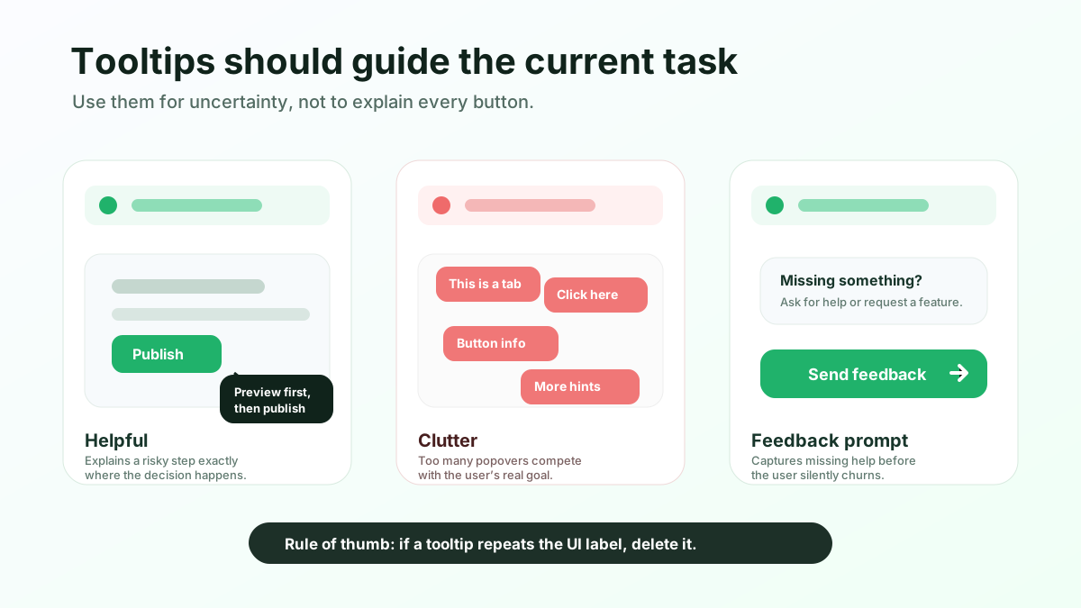
Also consider where tooltips should not appear. If a user is trying to complete a payment step, install code, import customer data, or publish something publicly, interruptions can increase anxiety. In those moments, inline guidance, previews, and confirmation copy may be better than a floating tooltip.
Finally, use onboarding feedback to refine tooltips. If three users ask the same question after seeing the same tooltip, rewrite it, move it closer to the decision, or replace it with a clearer empty state.
5. Watch real first-time users move through the flow
You cannot accurately judge onboarding only from inside your own team. Internal users know too much. They have seen the roadmap discussions, support tickets, and implementation tradeoffs. External testers reveal the assumptions you forgot you were making.
Start with five to eight people who match your target user closely enough to expose real confusion. Ask them to complete a specific job, not to “look around.” For example: “Create a feedback board and prepare it so customers can submit requests.” Then watch silently. Do not rescue them at the first hesitation. The hesitation is data.
After the session, ask what they expected after signup, which step felt unclear, where they worried about making a mistake, what information they looked for but did not find, and what would stop them from using this with their team.
Testing should include both observed sessions and unmoderated data. Session recordings, funnel analytics, support conversations, and feedback submissions each reveal different parts of the experience. The pattern matters more than any single complaint.
When you find friction, prioritize fixes by impact on activation. A confusing color label might be annoying, but unclear install instructions might block the entire trial. Rank issues by how often they appear, how severe they are, which user segment they affect, and whether they prevent the activation event.
This is also a strong place to use feature voting. If new users repeatedly ask for the same import option, integration, template, or permission model, voting helps you see whether the request is isolated or broad. Learn how to collect and prioritize those signals in this guide to feature voting.
6. Capture onboarding friction after the first session
The extra tip is the one many onboarding guides skip: onboarding does not end when the checklist reaches 100%. The first session teaches the user how to begin, but the next few sessions determine whether they adopt the product.
Users often discover missing pieces after the initial win. They may need a permission setting, a clearer notification, an integration, a customer-facing explanation, or a way to invite teammates. If they cannot easily tell you what is missing, they either contact support privately, invent a workaround, or leave.
A visible feedback loop turns those moments into product intelligence. It gives users a simple place to say, “I expected this,” “I need this before I can invite my team,” or “I do not understand this step.” For small teams, this is more realistic than running constant interviews or buying a large customer-success platform.
A good feedback loop for onboarding includes a widget or link inside the product, categories for bugs and questions, voting so repeated requests do not stay hidden, status updates so users know what is under review or shipped, and a weekly review habit.
This loop improves trust. Even when you cannot build every request, users see that there is a place for their input and a process for decisions. That matters during onboarding because trust is still fragile.
FeaturAsk is designed for this exact small-team workflow: add a simple widget, collect feature requests and questions, let users vote, and close the loop when improvements ship. No heavy setup, no enterprise process, and no need to stitch feedback together from email, chat, and spreadsheets.
Need a simple way for new users to ask for missing features or help during onboarding? Try FeaturAsk for one month free, no credit card required.
Onboarding patterns worth adapting carefully
The best onboarding examples share the same principle: they move users toward a real outcome quickly.
Canva helps users start from templates instead of a blank canvas. Notion uses templates and example pages so users can learn by editing something concrete. Slack guides teams toward inviting coworkers and sending messages because the product becomes valuable through collaboration.
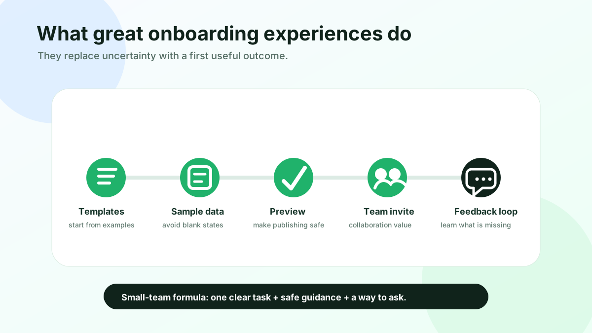
You do not need to copy these products directly. Instead, translate the pattern: if users face a blank page, provide templates or sample data; if value depends on collaboration, make one invite safe and obvious; if setup has technical risk, add previews and plain-language confirmation; if users may need missing functionality, give them a feedback path.
For small products, great onboarding often looks modest: a clear empty state, a two-step checklist, one helpful template, and a feedback widget. Simplicity is the advantage. Users understand the product faster, and your team can improve the experience without maintaining a complicated onboarding engine.
Final onboarding checklist
To enhance your user onboarding experience, stop thinking of onboarding as a tour and start treating it as an activation system. Your job is to help the right users reach value quickly, understand the next step, and tell you what still blocks them.
The 6 tips are straightforward:
- Learn from strong and weak onboarding examples.
- Define activation and design backward from it.
- Give users something meaningful to try.
- Use contextual tooltips where they reduce uncertainty.
- Test the experience with real users and real tasks.
- Keep a feedback loop open after the first session.
The final point is often the difference between a polished onboarding flow and a learning onboarding system. Users will always find gaps your team did not predict. When they can ask for missing help or features from inside the product, onboarding becomes easier to improve every week.
Ready to collect onboarding feedback, prioritize requests, and close the loop with users? Get started with FeaturAsk for $29.95/year, including a 30-day free trial with no card required.